6.2.1 UI (UI Version 1.0)
UI definitions and example definitions are shown below. For a description of the UI, see “UI design”.
(Table) UI definitions (UI version 1.0)
| Label | Default value | Required | Description | |||
|---|---|---|---|---|---|---|
| apiVersion: | 1.0 | Yes | API version | |||
| kind: | Yes | Specify "ui" for UI. | ||||
| type: | No | Only "resource" can be specified for UI. | ||||
| name: | Yes | Internal name of the UI definition. Specify the directory name for this YAML file. | ||||
| label: | Yes | YAML file display name | ||||
| includes: | No | List the related YAML files for use in this YAML file. | ||||
| - kind: | Yes | Type of YAML file to be loaded | ||||
| name: | Yes | Internal name of YAML file to be loaded | ||||
| description: | No | Detailed description | ||||
| editmode: | normal | No | The following can be specified.
|
|||
| components: | Yes | UI component | ||||
| - name: | Yes | Internal name of the component | ||||
| label: | No | Component display name | ||||
| type: | Yes | Specify the component type. For component types, see "(Table) Usable components (UI version 1.0)". |
||||
| (properties): | No | Varies depending on type. For descriptions, see "(Table) Grid properties (UI version 1.0)" to "(Table) Stepper properties (UI version 1.0)". |
||||
| children: | No | Child components for placement within components | ||||
| - name: | No | |||||
| (others): | No | |||||
| (action): | No | Define actions that are to be executed within the component. For details on actions, see "Script". | ||||
| buttons: | No | Define the action button | ||||
| - type: | Yes | Specify as "prepared as standard" or "set by the user themselves". For more information about types, see "(Table) Action button type (UI version 1.0)". | ||||
| name: | No | Button internal name | ||||
| label: | No | Button display name | ||||
| description: | No | Button description | ||||
| action: | No | Specify the action to be executed when a "custom" type button is clicked. For anything other than a "custom" type, do not specify anything. For details, see "Script". | ||||
| order: | No | Set the value for determining the display order of buttons. Displayed in ascending order. | ||||
| tables: | No | Define the table list to be displayed with the "load" button. | ||||
| - table: | No | Specify the table name for a custom table. Used with the "load" button. Specify when you want to obtain columns not defined in the "components" section. Sorting cannot be performed. |
||||
| fields: | No | Define the columns for retrieving from custom tables. Used with the "load" button. In addition to columns defined in the "components" section, obtain the columns defined in the next section, "field". | ||||
| - field: | No | Column names to be obtained | ||||
| action: | No | Define actions to be executed in the UI. For details, see "Script". | ||||
(Table) Action button type (UI version 1.0)
| Type | Description |
|---|---|
| start | Start the workflow. |
| save | Save the current records. |
| cancel | Cancel edits to the records and return to the previous window. |
| load | Open a list of past records and copy the column values of the selected records to the current form. The dialog box displays records related to the current window. Applicable to workflow lists and custom tables. |
| accept | Respond to core.ask actions with {oi_response: "accept"}. Advance the workflow to the next stage. |
| reject | Respond to core.ask actions with {oi_response: "reject"}. Return the workflow to what is was originally. |
| complete | Respond to core.ask actions with {oi_response: "accept"}. Complete the workflow. |
| custom | A button set the user themselves. Execute scripts for setting action items. |
| edit | Set whether to enable editing UI forms where "editmode" is set to "protected". |
If responding to core.ask actions with the accept, reject, or complete action buttons, it is necessary to add a schema to the input of the Task model as shown below, and to specify the structure of the response.
input:
schema:
type: object
properties:
oi_response:
type: string
required: true
For details on task models, see “Workflow”.
In the UI definition, configure the window using Reach and Material-UI. As shown in the figure below, use Grid, Paper, etc., to configure the layout of the window so that it is hierarchical in structure.
(Figure) Conceptual diagram of a window structured using React and Material-UI (UI version 1.0)
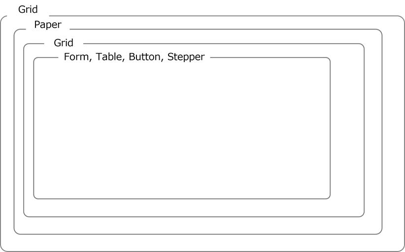
Shown below is a list of components that can be used within a UI definition and the properties of those components.
(Table) Usable components (UI version 1.0)
| Component | Material-UI | Description |
|---|---|---|
| Grid | Grid | A UI grid. For more details, see the website(s) below. https://v5.mui.com/material-ui/react-grid/ |
| Paper | Paper | Paper component for the Material-UI. Make sure that the contents are written on the paper. For more details, see the website(s) below. https://v5.mui.com/material-ui/react-paper/ |
| Form | TextField, Checkbox, Select |
Display and edit the contents of records from specified tables. For more details, see the website(s) below. https://v5.mui.com/material-ui/react-text-field/#main-content https://v5.mui.com/material-ui/react-checkbox/#main-content https://v5.mui.com/material-ui/react-select/#main-content |
| Table | DataGrid | DataGrid component for the Material-UI. For more details, see the website(s) below. https://v5.mui.com/x/react-data-grid/ Display a list of records from the specified table. |
| Button | Button | Define actions for each component and execute. |
| Stepper | Stepper | Stepper component for the Material-UI. Display the step. |
(Table) Grid properties (UI version 1.0)
| Label | Default value | Required | Description | ||
|---|---|---|---|---|---|
| components: | Yes | UI component | |||
| type: | Yes | Specify "grid". Grids can be adjusted. For more details, see the website(s) below. https://v5.mui.com/x/react-data-grid/ |
|||
| breakpoint: | Yes | Set breakpoints for this component. | |||
| xs: | No | ||||
| sm: | No | ||||
| md: | No | ||||
| lg: | No | ||||
| xl: | No | ||||
| isCon: | false | No | If "True" is specified, define "Grid" as "Grid Container". Specify when arranging grid components beneath this. | ||
(Table) Paper properties (UI version 1.0)
| Label | Default value | Required | Description | |
|---|---|---|---|---|
| components: | Yes | UI component | ||
| type: | Yes | Specify "paper". For more details, see the website(s) below. https://v5.mui.com/material-ui/react-paper/ |
||
| icon: | No | Specify the icon for the paper label. Can be specified from the material icons in the link below. https://v5.mui.com/material-ui/material-icons/ Example: AccountBalance |
||
| tabs: | No | Add a tab under "Paper". Parameters can be set in the same way as with the Tab component. Only the Toggle style is supported. | ||
(Table) Form properties (UI version 1.0)
| Label | Default value | Required | Description | |||||
|---|---|---|---|---|---|---|---|---|
| components: | Yes | UI component | ||||||
| type: | Yes | Specify "form". Display and edit records. |
||||||
| autorefresh: | Yes | Interval (in seconds) during which databases are monitored for updates. Be sure to specify 0 (seconds). |
||||||
| source: | Yes | The data source. Custom tables can be specified. | ||||||
| tables: | No | Specify a table of records to be displayed. | ||||||
| - table: | Yes | Specify a table for use for reference. The table used for reference must be included in the document specified with "includes". | ||||||
| apis: | No | Use when you want to reference information obtained by the API. The API to be used must be specified in the "includes" section. | ||||||
| - <CRUD>: | Yes | Specify the CRUD of the API to be used. Only "read" can be used. |
||||||
| name: | Yes | Specify the API name. Only "itsm:otobo:searchCustomers" can be used. If "itsm:otobo:searchCustomers" is specified, the following must be included using "includes".
|
||||||
| fields: | Yes | Specify the form fields. Displayed in the order defined here. |
||||||
| - type: | Yes | Specify "table". | ||||||
| field: | Yes | Specify the column name. Use the table.column format to specify the table name and column. | ||||||
| label: | Yes | Specify the display name on the form. | ||||||
| displayName: | Required if "table" is specified for "type" and "ref-sys" is set for "Datamodel" Otherwise, no restrictions on entry | Value to be displayed. Use for searches. Specify the names for the columns to be displayed. In such a case, specify using the following format: ref-sys table name.ref-sys column name. Example: if "table" is specified for "type" and "ref-sys" is set displayName: user.name |
||||||
| properties: | No | Set the field attributes in object.array. Set "readOnly" and "required". Example: properties: readOnly: false |
||||||
| readOnly: | false | No | Specify "true" or "false". If "true" is specified, it will not be possible to change the value of the corresponding field. |
|||||
| required: | false | No | Specify "true" or "false". If "true" is specified, it is necessary to fill in the corresponding field. If the field is saved without specifying a value, an error will be displayed. |
|||||
| validation: | No | Input check rules | ||||||
| regex: | No | Set a regular expression for the text. Can only be used when the column type is set to "varchar" or "text". For more information on column types, see "(Table) Column types". |
||||||
| min: | No | Set the minimum value. Can only be used when the column type is set to "integer", "numeric", "varchar", or "text". For more information on column types, see "(Table) Column types". If the following column types are set, evaluate based on the size of the numeric value.
|
||||||
| max: | No | Set the maximum value. Can only be used when the column type is set to "integer", "numeric", "varchar", or "text". If the following column types are set, evaluate based on the size of the numeric value.
|
||||||
| message: | No | Message displayed when there is an input check error Example: Invalid e-mail address. |
||||||
| load: | true | No | Specify whether or not to make a column the target column when copying using the "load" button.
|
|||||
| lookup: | No | If lookup is specified, it is treated as a lookup field. If the specified field is document-related, selection options from the specified folder path or filename are displayed. |
||||||
| type: | Yes | The following types can be set
|
||||||
| filter: | No | Set the filtering condition. If the type has been specified as "table", and the specified field is document-related, filter the displayed records. |
||||||
| - | No | |||||||
| - operator: | Yes | The conditional operator for this condition. The following can be used.
The conditional operator compares the values for firstOperand and secondOperand in a text-string format. |
||||||
| firstOperand: | Yes | 1st target of comparison. Specify the field name for the table. Example: role.id If the type is specified as "table", the document path can be specified. All of the following files are determined in the specified folder. Example: /myGroup/myRepository/MyDocPath |
||||||
| secondOperand: | Yes | 2nd target of comparison. Specify the values of the firstOperand and the operator. The template definition can be used. For usable template definitions, see "(Table) Usable template definitions". If using in/notIn for "operator" and not using template definitions, add a list using a text string with entries separated by a comma. Example:
|
||||||
| field: | Yes | Field name for the reference table. If the type is specified as "table", specify the column name. Use the table.column format to specify the table name and column. Example: group.id If the type is specified as "api", specify the property name. Using the format api.property, specify the property name. Only the following can be specified
|
||||||
| searchQuery: | No | Set query parameters for when using autocomplete. Use when the type is specified as "api". Only "name" can be specified. If specified, the lookup field choices are displayed. | ||||||
| displayColumn: | No | Use the table name.column name format to specify the columns that will be displayed as options when using "lookup". For details on forming table definitions and their descriptions, see "Datamodel". (Example)
Only the following can be specified
Example: displayColumn: - user.name - user.role - user.group |
||||||
*Use template definitions if specifying this conditional operator.
(Table) Table properties (UI version 1.0)
| Label | Default value | Required | Description | |||
|---|---|---|---|---|---|---|
| components: | Yes | UI component | ||||
| type: | Yes | Specify "table". Display a list of records from the specified table. | ||||
| source: | Yes | The data source. Specify custom tables. The table to be used must be specified in the "includes" section. | ||||
| table: | No | Specify the table name. | ||||
| autorefresh: | 5 | No | Specify an interval (in seconds) during which databases are monitored for updates. Reload the component if the database has been updated. If 0 (seconds) has been specified, it will not automatically update. |
|||
| selection: | No | Specify "checkbox" or "radio". If specified, a checkbox or radio button is added. *Radio buttons are used to specify a single value. |
||||
| toolbar: | false | No | If "true", add a toolbar to the table. | |||
| rowCount: | 5 | No | Specify the number of rows to be displayed in the table. | |||
| columns: | No | Specify the table columns. Displayed in the order defined here. |
||||
| - column: | Yes | Specify the field name for the table. The format is as below. "table": table name.column name |
||||
| label: | No | Specify the column display name. | ||||
| editable: | false | No | Specify whether it is editable or not.
|
|||
| sortable: | false | No | Specify whether it is sortable or not.
|
|||
| hide: | false | No | Specify whether or not columns are hidden. If "true" is specified, the column will be hidden. |
|||
| type: | auto | No | The display format for columns. The following can be specified.
|
|||
| properties: | No | Set the properties. Can currently only be used for the "chip" type. If using the "chip" type, an error will be displayed ("An error occurred") if the "properties" are not set. |
||||
| color: | primary | No | The following color props can be specified. Set to "primary" by default https://v5.mui.com/material-ui/react-chip/#color-chip |
|||
| variant: | filled | No | The following can be specified.
|
|||
| attachment: | No | If "attachment" has been specified, specify the attachment file. | ||||
| kind: | Yes | Specify the document type. | ||||
| name: | Yes | Specify the document name. | ||||
(Table) Table column type (UI version 1.0)
| Column type | Description |
|---|---|
| auto | Set according to the specified columns from the Datamodel. |
| chip | Display chips along with column values. For more details, see the website(s) below. https://v5.mui.com/material-ui/react-chip/ 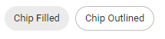 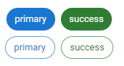 |
| attachment | Attach a file to the record. |
(Table) Button properties (UI version 1.0)
| Label | Default value | Required | Description | ||
|---|---|---|---|---|---|
| components: | Yes | UI component | |||
| type: | Yes | Specify "button". Execute actions defined for each component. Placed to the right end of the grid. |
|||
| buttons: | Yes | Configure detailed button settings. | |||
| - name: | Yes | Button name | label: | No | Button display name | action: | Yes | Specify the action to be executed when a button is clicked. For details, see "Script". |
(Table) Stepper properties (UI version 1.0)
| Label | Default value | Required | Description | |
|---|---|---|---|---|
| components: | Yes | UI component | ||
| type: | Yes | Specify "stepper". Can only be placed on the workflow window. | ||
| maxDepth: | 3 | No | Number of subflow levels | |
| maxIndentDepth: | 3 | No | Number of indents per subflow level | indentRem: | 1.5 | No | Indent unit. For more details, see the website(s) below. https://www.w3.org/TR/css-values-3/#rem |
stepWidthRem: | No | Width of each step |
| collapsed: | false | No | Initial display settings for subflow tasks
|
sx: | No | Can be specified based on the sx properties of the Material-UI. For more details, see the website(s) below. https://v5.mui.com/system/getting-started/the-sx-prop/ Example: Height adjustment sx: maxHeight: 35rem |
targetSteps: | No | List of steps to be displayed. Display steps that have been specified by the specified name. If this attribute is not specified, all steps defined in the workflow are displayed. Example: In the case of the following, # step2 is not displayed - step1 # - step2 - step3 |
<Definition example>
apiVersion: 1.0
kind: ui
type: resource
name: create_vm_ui_01
label: create_vm_ui_01
description: YAML definition of the application window
includes:
- kind: datamodel
name: lend_vm_datamodel
components:
- name: lend_vm_grid
label: grid
type: grid
breakpoint:
xs: 12
children:
- name: lend_vm_paper
label: application form
type: paper
icon: Assignment
children:
- name: lend_vm_form
label: application form
type: form
autorefresh: 0
source:
tables:
- table: lend_vm_table
fields:
- field: lend_vm_table.app_number
label: application number
type: table
properties:
readOnly: true
required: false
- field: lend_vm_table.sys_name
label: system name
type: table
properties:
readOnly: false
required: true
(omitted)
- field: lend_vm_table.cpu
label: CPU (No. of cores)
type: table
properties:
readOnly: false
required: true
validation:
min: 4
max: 128
message: Enter an integer from 4 to 128.
- field: lend_vm_table.memory
label: memory (GB)
type: table
properties:
readOnly: false
required: true
validation:
min: 32
max: 256
message: Enter an integer from 32 to 256.
- field: lend_vm_table.storage
label: storage (GB)
type: table
properties:
readOnly: false
required: true
validation:
min: 10
max: 4096
message: Enter an integer from 10 to 4096.
- field: lend_vm_table.created_by
label: use applicant
type: table
properties:
readOnly: true
required: false
- field: lend_vm_table.start_date
label: use start date
type: table
properties:
readOnly: false
required: true
- field: lend_vm_table.message
label: message items
type: table
properties:
readOnly: false
required: false
buttons:
- type: start
name: start
label: Apply
- type: cancel
name: cancel
label: Cancel