4.4.1 UI version
UI versions 1.0 and 1.1 are available. Compared to UI version 1.0, UI version 1.1 has been enhanced as follows.
- Increased flexibility in user-created windows
- Improved customizability of windows provided in Ops I
- Improved readability of UI YAML files and reduced amount of manual configuration
For details on the enhanced and added functions, see “Enhanced and added functions”.
UI version 1.1 is used for the windows that Ops I provides in the window, ticket, and schedule tabs. Users also can create windows using the UI version 1.1 components for the workflow, ticket, and schedule tabs. For details, see “Specifying a UI version” and “Differences between YAML definition methods”.
However, the Stepper component and the Load function are not yet supported in UI version 1.1. Use UI version 1.0 when using these functions.
(1) Specifying a UI version
Use the apiVersion label in the YAML file to specify the UI version. Both UIs created with UI versions 1.0 and 1.1 can be displayed.
- When using UI version 1.0, specify “apiVersion: 1.0”.
- When using UI version 1.1, specify “apiVersion: 1.1”.
The Script and Uipath YAML definitions are the same regardless of the UI version in the UI YAML file, but the JavaScript definitions that define actions differ depending on the UI version. For details, see the references in the following table.
(Table) Definition files for each UI version
| YAML definition | UI version 1.0 | UI version 1.1 |
|---|---|---|
| UI | UI (UI Version 1.0) | UI (UI Version 1.1) |
| Script | Script (apiVersion is 1.0) | |
| JavaScript | Action scripts (UI Version 1.0) | Action scripts (UI Version 1.1) |
| Uipath | Uipath (apiVersion is 1.1) | |
(2) Differences between YAML definition methods
The definition method differs depending on the UI version as follows.
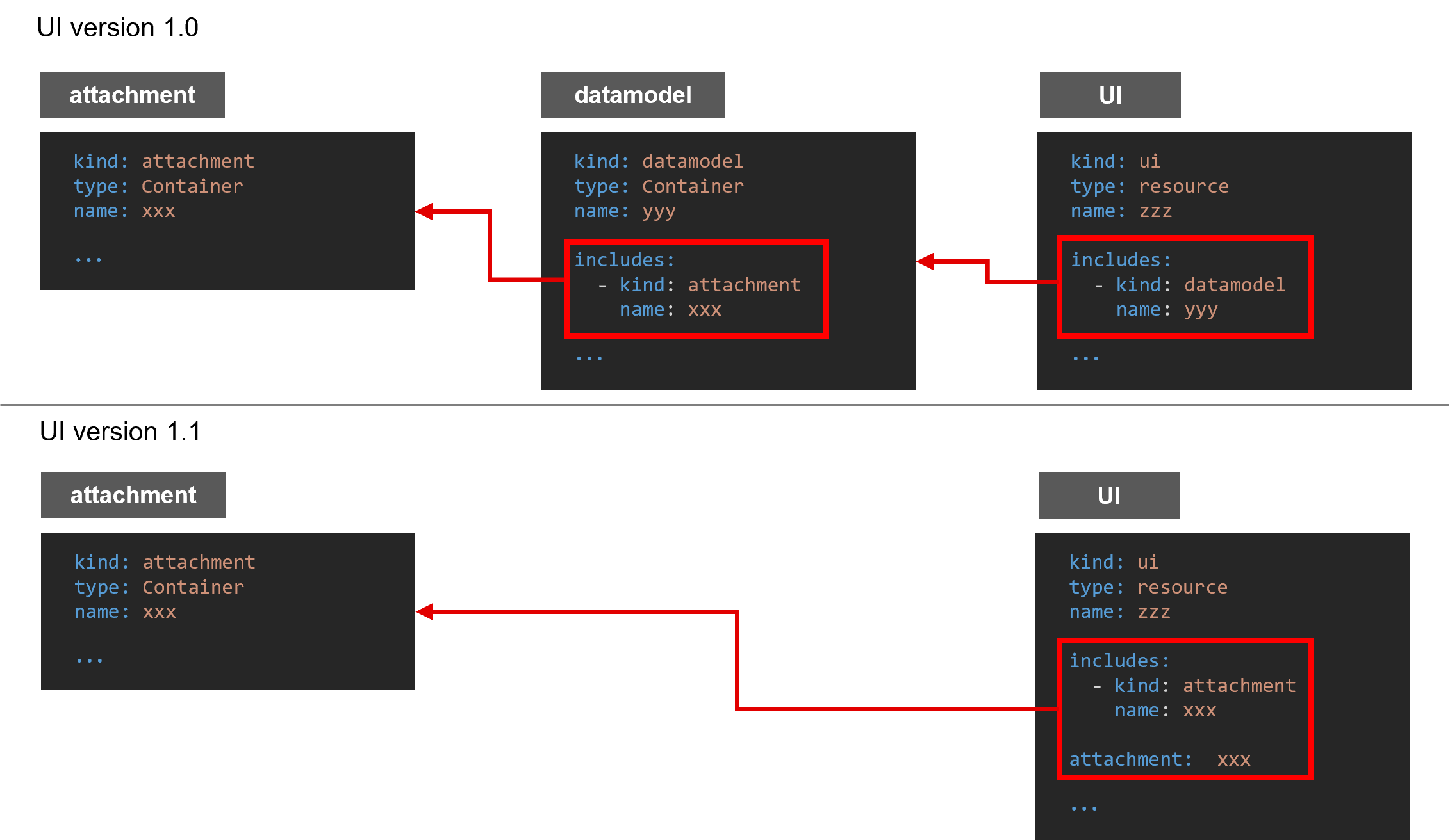
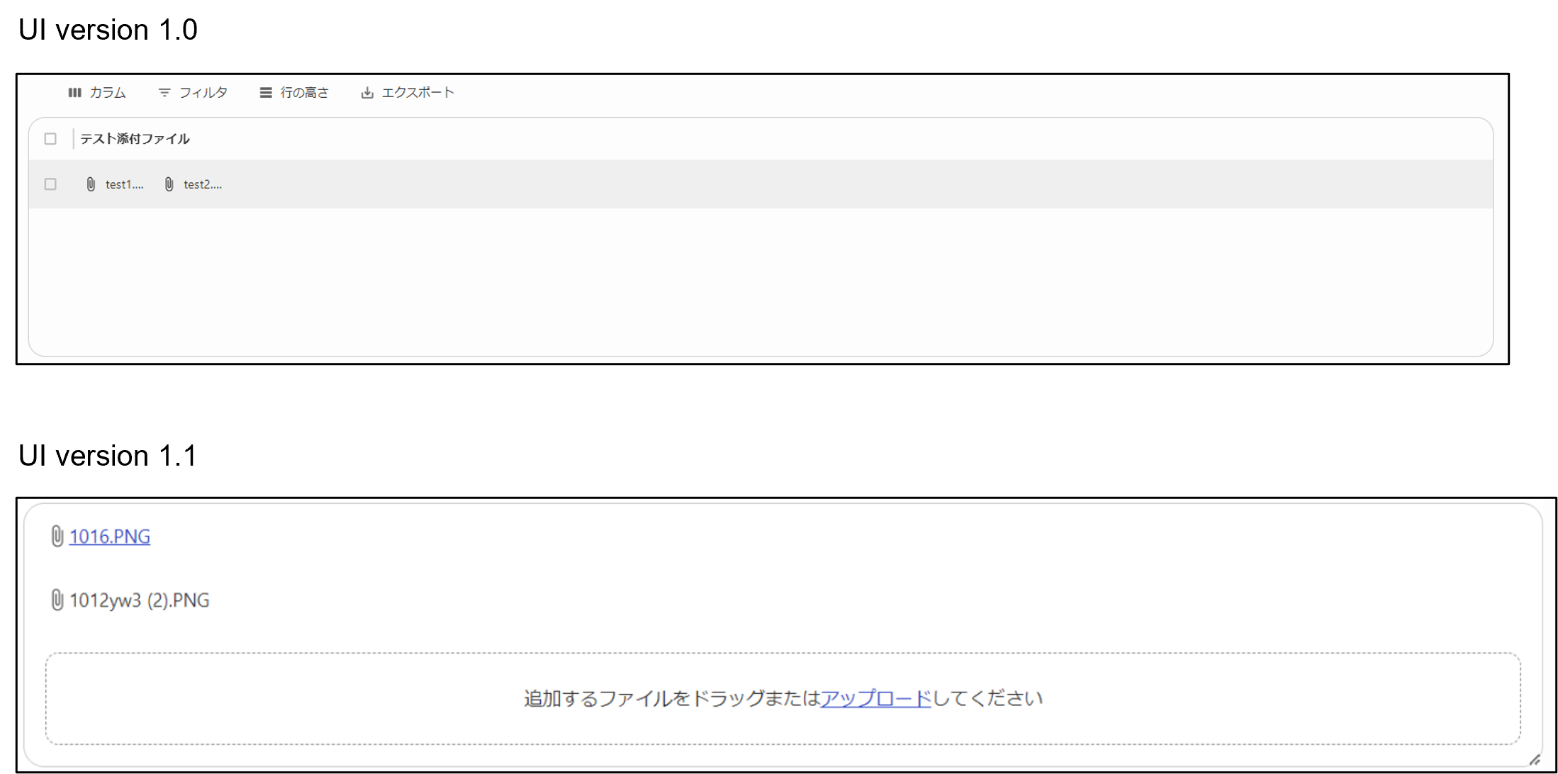
In UI version 1.0, the Attachment definition is referenced from the UI via Datamodel, but in UI version 1.1, the Attachment definition is referenced directly from the UI.
(Figure) How to define attachments
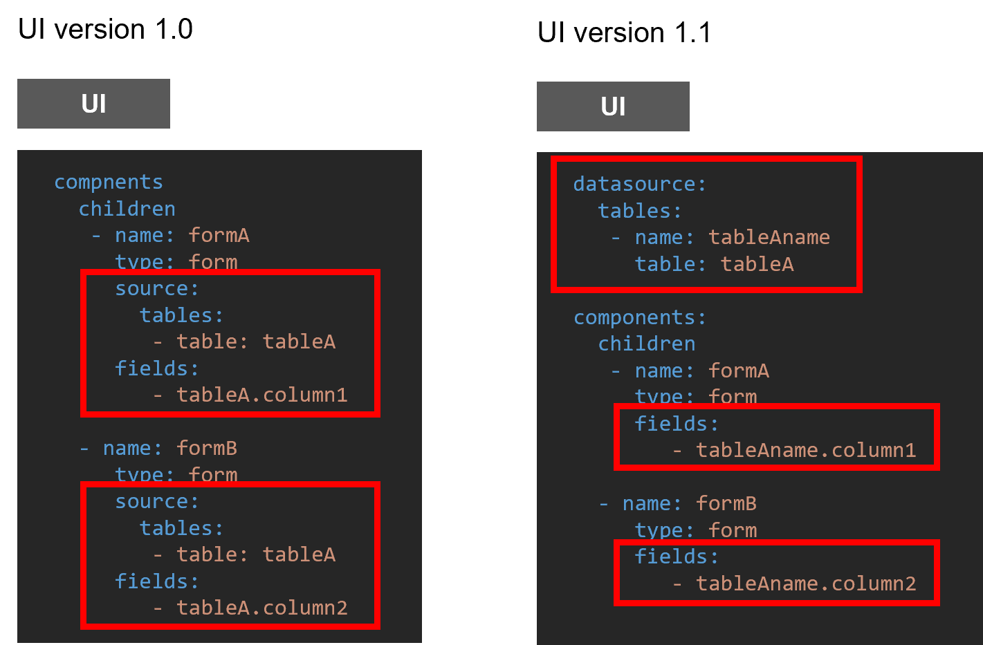
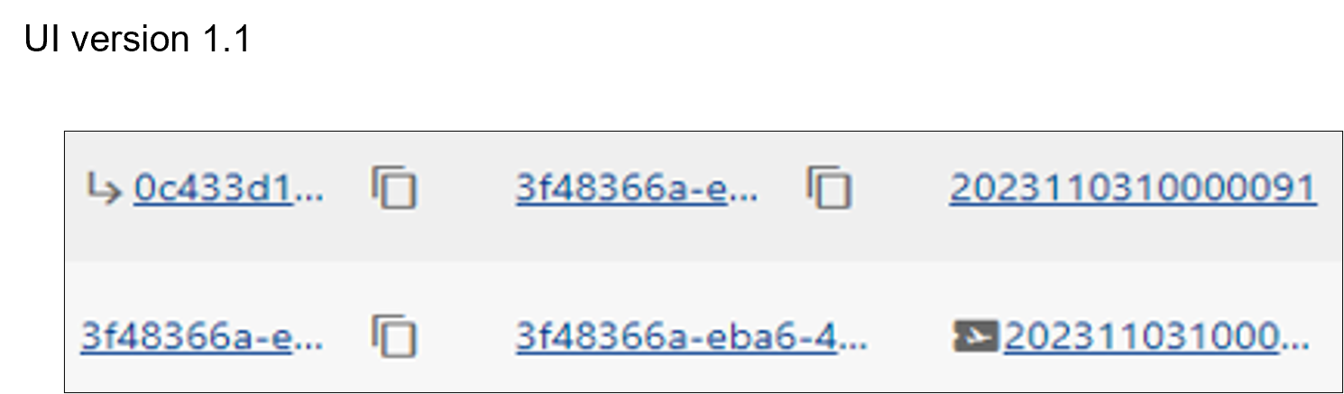
In UI version 1.0, data sources are specified for each Form and Table, but in UI version 1.1, data sources are specified for each UI. This improves communication performance.
(Figure) How to define data sources
Compared to UI version 1.0, the scripts in UI version 1.1 for each component have more descriptive names that suggest their functions.
The following actions use different scripts between UI versions 1.0 and 1.1. For details, see “Action scripts (UI Version 1.0)” and “Action scripts (UI Version 1.1)”.
(Table) Scripts for each version
| Action | UI version 1.0 | UI version 1.1 |
|---|---|---|
| [Workflow] Obtaining context |
OICommon(Form_Name).getComponent().[Form_Name].context | OIUi.getContext() |
| [Form] Obtaining the current input value |
OICommon(Form_Name).getComponent().[Form_Name].current.table[customTable_Name] | OIForm(Form_Name).getFieldValues() OIForm(Form_Name).getFieldValue("field1") It is also possible to obtain only the value of a specified field |
| [Form] Performing validation |
OICommon(Form_Name).formValid() | OIForm(Form_Name).validate() |
| [Table] Obtaining the ID of the selected row |
OICommon(Table_Name).getComponent().[Table_Name].rowsSelected | OITable(Table_Name).getSelectedRows() All data in the selected row can be obtained. |
| [General] Switching displays |
OICommon(Object_Name).hide()/show() | OIForm(Form_Name).setVisible(true/false) OIActionButton(ActionButton_Name).setVisible(true/false) |
| Displays cannot be switched on a per-form-field basis | OIForm(Form_Name).setFieldVisible(fieldName, true/false) |
(3) Enhanced and added functions
This section describes the functions enhanced and added in UI version 1.1.
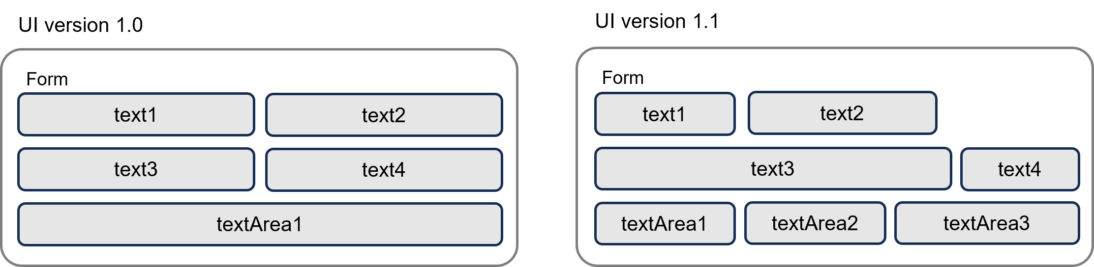
- The width of fields can be set freely by ratio.
(In UI version 1.0, textAreas are fixed to the width of the Form, and all other components are fixed to half the width of the Form.) - Placement wrapping is possible at any position.
- Three or more textAreas can be placed.
- The width of a textArea can be specified according to the Window size.
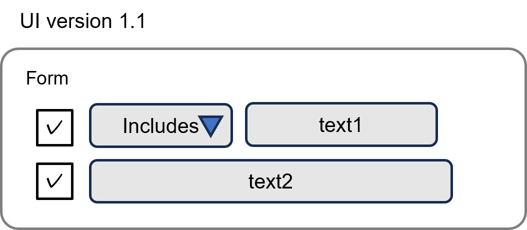
- Checkboxes and pull-down menus can be displayed in fields.
- Field values can be set for the following actions.
- OIForm.setFieldValue
- OIForm.setFieldExtensions
- Files can be arranged vertically instead of horizontally.
- Files can be saved with drag and drop operation.
- The Card component can be used for links, etc.

- Material UI icons can be displayed on either side of a cell.
- The display can be controlled according to conditions.
- Actions can be associated with icons and executed on click.
- The colors can be customized using color codes.
- The colors can be switched according to conditions.
- Stepper icons can be displayed with a type specified.
- The icon types can be switched according to conditions.
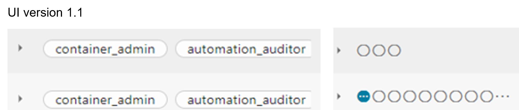
- Multiple values can be displayed in a single cell.
- Form components with original field configurations can be created and values entered in a Form can be reflected in a Table component.
- Selected tickets and other information can be displayed in tabs, like in the ticket details tab of the ticket browser window. For details, see ② in "(Figure) Ticket browser window".
- The action buttons (standard action buttons) that Ops I provides in workflows can be customized. For details, see "Customizing standard action buttons".
- The function to save display settings made by the user for a table can be configured. For details, see "Saving a table display".
- The function to display hint messages for each input field in user-created windows can be configured. For details, see "Displaying hint messages".