6.2.2 UI (UI Version 1.1)
UI definitions and example definitions are shown below. For a description of the UI, see “UI design”.
(Table) UI definitions (UI version 1.1)
| Label | Default value | Required* | Description | |||||
|---|---|---|---|---|---|---|---|---|
| apiVersion: | Yes | API version Specify 1.1 |
||||||
| kind: | Yes | Specify "ui". | ||||||
| type: | No | Specify "resource". It indicates a new definition to be added to the operational function of Ops I. |
||||||
| name: | Yes | Internal name of the UI definition. "name" must follow the following rules:
|
||||||
| label: | Yes | Display name of the operational function written in the YAML file | ||||||
| includes: | No | List the related YAML files for use in this YAML file.
 Tips
|
||||||
| - kind: | Yes | Type of YAML file to be loaded | ||||||
| name: | Yes | Internal name of YAML file to be loaded | ||||||
| description: | No | Detailed description of this YAML file. This can be written using the template function. | ||||||
| editmode: | normal | No | The following can be specified.
|
|||||
| rememberViewSettings: | false | No | Using the table components, specify the following settings for when a user changes the display.
|
|||||
| context: | No | How to obtain the contextID | ||||||
| type: | No | The following can be specified.
|
||||||
| value: | No | The following can be specified by type.
|
||||||
| attachment: | No | "name" of the Attachment YAML file Attachment can be used only in workflows. |
||||||
| dataSource: | No | Data source to be used | ||||||
| schemas: | No | Specify this when you want to use a form that temporarily uses entered data without using the custom table. Example: Entering filter conditions, entering search conditions |
||||||
| - name: | Yes | User-defined name. Must be unique within schemas. | ||||||
| schema: | Yes | Name of the schema for the YAML file of the Datamodel specified with "includes" | ||||||
| apis: | No | Specify when using an API for the "source" label of a lookup field in a Form component. | ||||||
| - name: | Yes | User-defined name. The name must be unique within the "apis" label. | ||||||
| api: | Yes | Set the following values:
|
||||||
| parameters: | No | |||||||
| - name: | Yes | Specify from "sortBy", "filterBy", or "subscribed". For details, see "(Table) dataSource.apis settings". |
||||||
| parameter: | Yes | |||||||
| type: | Yes | Specify "fixed". | ||||||
| value: | Yes | Specify a fixed value. | ||||||
| origin: | No | Path to target data For fields in the Form component and the Table component, specify the path beyond this field. Must be valid for the JSON Schema of the API response. |
||||||
| tables: | No | Specify when using custom tables. For details about custom tables, see "Types of datamodels". |
||||||
| - name: | Yes | User-defined name. Must be unique within tables. | ||||||
| table: | Yes | Name of the table for the YAML file of the Datamodel specified with "includes" | ||||||
| view: | No | Specify detailed processing by application of the data model. | ||||||
| <CRUD>: | No | Specify the application (create/read/update/delete). | ||||||
| - graphql: | Yes | User-defined GraphQL. If "null", use the default GraphQL for the UI foundation. When using with a Form or Table component that has the mode set to server, be sure to specify null. | ||||||
| override: | No | Use if the graphql property is "null". Overwrite the default GraphQL filter. This can be specified when used with Form or Table components that have the mode set to client. | ||||||
| <<HASURA table field arguments>>: | No | Properties available for use with graphql | ||||||
| parameters: | No | Parameters for graphql | ||||||
| - name: | Yes | Parameter name Must be unique within parameters. |
||||||
| parameter: | Yes | |||||||
| type: | Yes | The following can be specified.
|
||||||
| value: | Yes | Specify the following by type.
|
||||||
| autorefresh: | 0 | No | Automatic refresh interval (seconds) | |||||
| action: | No | Specify the action to occur in datamodel. For details on actions, see "Script". Capture "handleAfterLoadData" from "(Table) List of execution timings for each component and function names (UI Version 1.1)" and perform the processing. | ||||||
| views: | No | Specify when using custom views. For details about custom views, see "Types of datamodels". |
||||||
| - name: | Yes | User-defined name. The name must be unique within the "views" label. | ||||||
| source: | Yes | View name in the Datamodel YAML file specified in the "includes" label | ||||||
| view: | No | Specify detailed processing by application of the data model. | ||||||
| <CRUD>: | No | Specify the purpose (create/read/update/delete). Only "read" can be specified. | ||||||
| - graphql: | Yes | Yes | GraphQL defined by the user. If null, the default GraphQL of the UI platform is used. When using with a Form or Table component that has the mode set to server, be sure to specify null. | |||||
| override: | No | Use when the graphql property is null. Overwrite the default GraphQL filter. This can be specified when used with Form or Table components that have the mode set to client. | ||||||
| <<HASURA table field arguments>>: | No | Properties available in graphql | ||||||
| parameters: | No | Parameters for graphql | ||||||
| - name: | Yes | Parameter name The name must be unique within the "parameters" label. |
||||||
| parameter: | Yes | |||||||
| type: | Yes | The following can be specified.
|
||||||
| value: | Yes | Specify the following depending on "type".
|
||||||
| autorefresh: | 0 | No | Automatic refresh interval (seconds) | |||||
| action: | No | Specify the action to occur in datamodel. For details on actions, see "Script". Capture "handleAfterLoadData" from "(Table) List of execution timings for each component and function names (UI Version 1.1)" and perform the processing. | ||||||
| components: | Yes | UI component | ||||||
| - name: | Yes | Internal name of the component | ||||||
| label: | No | Component display name | ||||||
| type: | Yes | Specify the component type. For component types, see "(Table) Usable components (UI version 1.1)". However, there should only be one attachment in the UI. |
||||||
| properties: | No | Use the Label:Value format to specify the property value by type. For descriptions of properties, see "(Table) Grid properties (UI version 1.1)" to "(Table) Icon properties (UI version 1.1)". | ||||||
| children: | No | Child components displayed on the components. The same properties and restrictions as with parent components apply. | ||||||
| - name: | No | |||||||
| (others): | No | |||||||
| action: | No | Define actions that are to be executed within the component. For details on actions, see "Script". | ||||||
| buttons: | No | Define the action button Displayed in the specified position as a button for controlling the entire UI. |
||||||
| - name: | Yes | Internal name of the button | ||||||
| label: | No | Button display name | ||||||
| type: | Yes | Specify as prepared as standard or set by the user themselves;. For more information about types, see "(Table) Action button type (UI version 1.1)". | ||||||
| description: | No | Button description | ||||||
| order: | No | Set the value for determining the display order of buttons. Displayed in ascending order. | ||||||
| properties: | No | Use the Label:Value format to specify the property value. For descriptions of properties, see "(Table) Button properties (UI version 1.1)". | ||||||
| action: | No | Specify the action that will be performed when clicking on a button that a user has set themselves or a user-customized version of a button prepared as standard. Do not specify if using buttons prepared as standard and without any customization. For details, see "Script". | ||||||
(Table) Action button type (UI version 1.1)
| Type | Description |
|---|---|
| start | Start the workflow. |
| save | Save the current records. |
| cancel | Cancel edits to the records and return to the previous window. |
| accept | Respond to core.ask actions with {oi_response: "accept"}. Advance the workflow to the next stage. |
| reject | Respond to core.ask actions with {oi_response: "reject"}. Return the workflow to what is was originally. |
| complete | Respond to core.ask actions with {oi_response: "complete"}. Complete the workflow. |
| custom | A button set the user themselves. Execute scripts for setting action items. |
| edit | Set whether to enable editing UI forms where "editmode" is set to "protected". |
If responding to core.ask actions with the accept, reject, or complete action buttons, it is necessary to add a schema to the input of the Task model as shown below, and to specify the structure of the response.
input:
schema:
type: object
properties:
oi_response:
type: string
required: true
For details on task models, see “Workflow”.
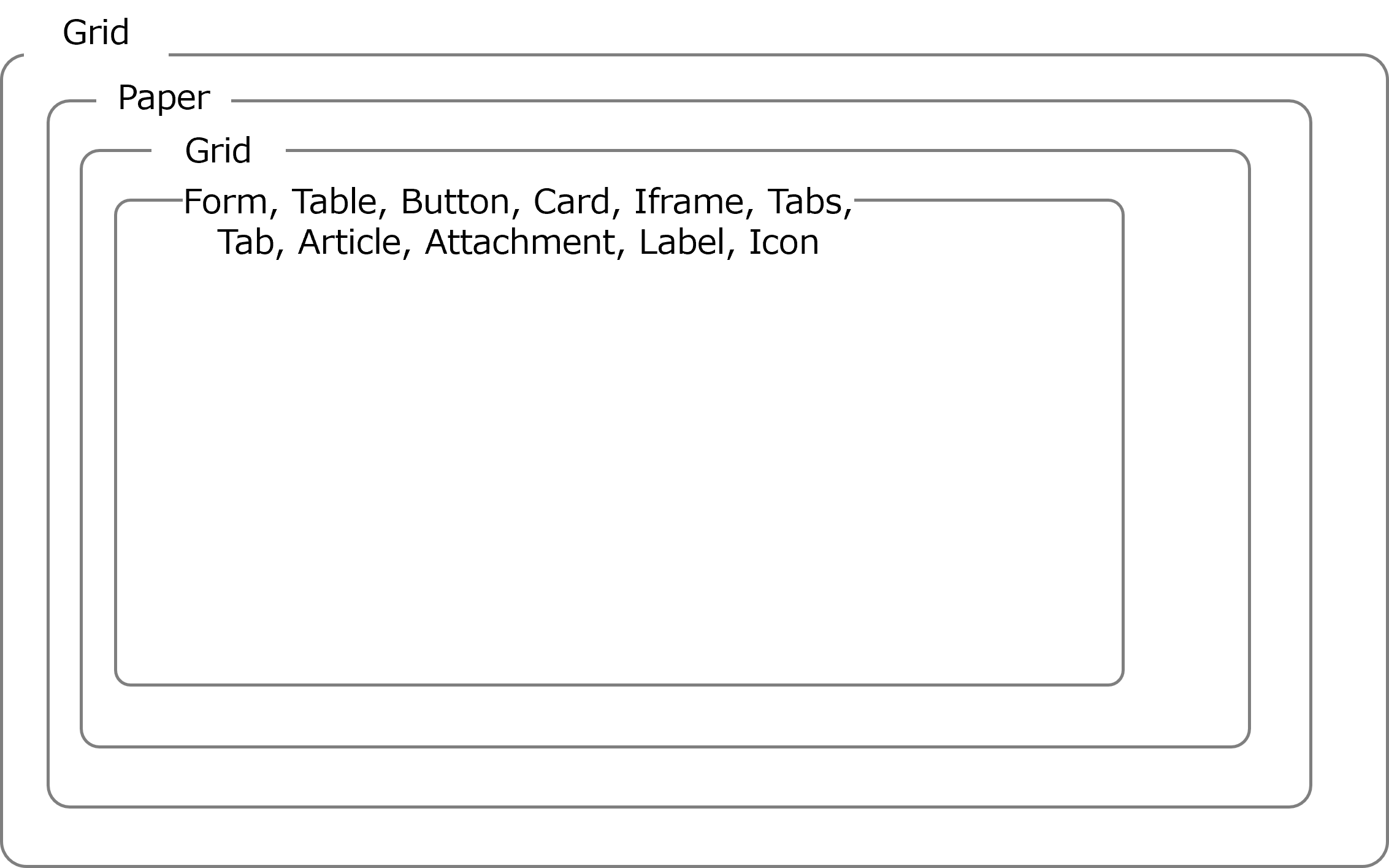
In the UI definition, configure the window using Reach and Material-UI. As shown in the figure below, use Grid, Paper, etc., to configure the layout of the window so that it is hierarchical in structure.
(Figure) Conceptual diagram of a window structured using React and Material-UI (UI version 1.1)
Below is a list of components that can be used within a UI definition and the properties of those components.
(Table) Usable components (UI version 1.1)
| Component | Material-UI | Description |
|---|---|---|
| Grid | Grid | A UI grid. For more details, see the website(s) below. https://v7.mui.com/material-ui/react-grid/ |
| Paper | Paper | Paper component for the Material-UI. Make sure that the contents are written on the paper. For more details, see the website(s) below. https://v7.mui.com/material-ui/react-paper/ |
| Form | TextField, Checkbox, Select |
Display and edit the contents of records from specified tables. For more details, see the website(s) below. https://v7.mui.com/material-ui/react-text-field/#main-content https://v7.mui.com/material-ui/react-checkbox/#main-content https://v7.mui.com/material-ui/react-select/#main-content |
| Table | DataGrid | DataGrid component for the Material-UI. For more details, see the website(s) below. https://v7.mui.com/x/react-data-grid/ Display a list of records from the specified table. |
| Button | Button | Define actions for each component and execute. |
| Card | Card | Card component for the Material-UI. Display cards that can be used for links, etc. |
| Iframe | - | Displays the content specified by the URL. |
| Tabs | - | Specify the type of tab using "tab", "toggle", and "dynamic". |
| Tab | Tabs | If the type of tab component is set to "toggle", specify the icon that is to be displayed from among the Material-UI tabs components. The tabs component cannot be used alone or placed as a child component other than as a tabs component. |
| Article | - | Display a memo-type note in a comment bubble. |
| Attachment | - | Upload or download files. Attachment can be used only in workflows. |
| Label | Typography | Displays text. |
| Icon | Material Icons | Displays icons. For details, see the following: https://v7.mui.com/material-ui/material-icons/ |
(Table) Grid properties (UI version 1.1)
| Label | Default value | Required | Description | ||
|---|---|---|---|---|---|
| components: | Yes | UI component | |||
| type: | Yes | Specify "grid". Grids can be adjusted. For more details, see the website(s) below. https://v7.mui.com/x/react-data-grid/ |
|||
| properties: | No | ||||
| xs: | 12 | No | Specify the width size of the Grid. The width size is based on a 12-column grid per row, and the specified value indicates how many columns it occupies. For each browser width, the size can be specified as an integer ratio from 1 to 12. If omitted, the setting for a smaller width is applied.
If you omit all width specifications, the width size will always be 100% of one row according to the default value (xs: 12). However, if width or maxWidth is specified, the width size is not applied. |
||
| sm: | No | ||||
| md: | No | ||||
| lg: | No | ||||
| xl: | No | ||||
| container: | false | No | Specify that this is the parent element within the grid. | ||
| item: | false | No | Specify that this is the child element within the grid. | ||
| justifyContent: | No | Specify where on the horizontal axis the child element (grid item) should be placed using the parent element (grid container). This can be specified based on the properties of the justifyContent in the Material-UI. For more details, see the website(s) below. https://v7.mui.com/material-ui/react-grid/ |
|||
| maxHeight: | No | Maximum height | |||
| maxWidth: | No | Maximum width | |||
| minHeight: | No | Minimum height | |||
| minWidth: | No | Minimum width | |||
| height: | No | Height | |||
| width: | No | Width | |||
(Table) Paper properties (UI version 1.1)
| Label | Default value | Required | Description | ||
|---|---|---|---|---|---|
| components: | Yes | UI component | |||
| type: | Yes | Specify "paper". For more details, see the website(s) below. https://v7.mui.com/material-ui/react-paper/ |
|||
| properties: | No | ||||
| icon: | No | Specify the icon for the paper label. Specify from the material icons in the link below. https://v7.mui.com/material-ui/material-icons/ Example: AccountBalance |
|||
| collapsible: | false | No | Specify whether the paper can be opened or closed.
|
||
| expanded: | true | No | Specify whether Paper is opened. Valid when collapsible is "true".
|
||
| hintMessage: | No | Set text strings to be displayed as hint messages. Display a question mark icon next to the label. Click on the question mark icon to display the set values. | |||
(Table) Form properties (UI version 1.1)
| Label | Default value | Required | Description | ||||||||
|---|---|---|---|---|---|---|---|---|---|---|---|
| components: | Yes | UI component | |||||||||
| type: | Yes | Specify "form". Display and edit records. |
|||||||||
| properties: | No | ||||||||||
| fields: | Yes | Specify the Form fields. Displayed in the order defined here. For details on field types, see "(Table) Correspondence table: field types in the Form component and column types in custom tables in the Datamodel YAML file" or "(Table) Correspondence table: field types in the Form component and definition of the JSON Schema file in the Datamodel YAML file". |
|||||||||
| - name: | Yes | Specify a unique name within "fields". | |||||||||
| source: | Yes | Specify the type of dataSource to be used from "table", "view", "schema", or "padding". | |||||||||
| field: | Required if source is set to anything other than "padding" | Specify "all" when source is "table" or "schema". Specify "read" when source is "view". | |||||||||
| all: | No | Specify the field of the data source to be associated with the field of the Form when the source is "table" or "schema". table.field format. The table section must exist within dataSource.tables.name, or "context" must be specified. Currently, "context" can be specified as follows.
|
|||||||||
| read: | No | Specify the field of the data source to be associated with the field of the Form when the source is "view". | |||||||||
| label: | Required if source is set to anything other than "padding" | Specify the display name on the Form. | |||||||||
| displayName: | Required if "table" is specified for "source" and "ref-sys" is specified for "Datamodel" | Value to be displayed. Use for searches. Specify the names for the columns to be displayed. In such a case, specify using the following format: ref-sys table name.ref-sys column name. Example: if "table" is specified for "source" and "ref-sys" is set displayName: user.name |
|||||||||
| hintMessage: | No | Set text strings to be displayed as hint messages. Display a question mark icon next to the field. Click on the question mark icon to display the set values. | |||||||||
| properties: | No | Specify the field attributes in object.array. Specify "readOnly", "password", "required", "operator", "visible", "checkbox", "xs", "sm", "md", "lg", or "xl". Example: properties: readOnly: false |
|||||||||
| readOnly: | false | No | Specify "true" or "false". If "true" is specified, it will not be possible to change the value of the corresponding field. | ||||||||
| password: | false | No | Specify whether it is a password. If it is a password, the input value will be masked. Specify "true" or "false". |
||||||||
| required: | false | No | Specify "true" or "false". If "true" is specified, it is necessary to fill in the corresponding field. If the field is saved without specifying a value, an error will be displayed. | ||||||||
| operator: | false | No | Specify whether or not the operator selection list is displayed to the left side of the text field. Specify "true" or "false". |
||||||||
| visible: | true | No | The following can be specified.
|
||||||||
| checkbox: | false | No | The following can be specified.
|
||||||||
| xs: | 12 | No | Specify the field width size of the Form. The width size is based on a 12-column grid per row, and the specified value indicates how many columns it occupies. For each browser width, the size can be specified as an integer ratio from 1 to 12. If omitted, the setting for a smaller width is applied.
If all width specifications are omitted, the default values (xs: 12, sm: 6) apply, and the display will be in one column when the browser width is less than 600px, and in two columns when it is 600px or more. |
||||||||
| sm: | 6 | No | |||||||||
| md: | No | ||||||||||
| lg: | No | ||||||||||
| xl: | No | ||||||||||
| multiline: | false | No | The following can be specified.
|
||||||||
| maxRows: | No | Specify the number of lines. Automatically change the height of the TextField until it reaches the specified number of rows. Enabled when multiline is set to "true". | |||||||||
| rows: | No | Specify the number of lines. Display at a height of the specified number of lines from the start. Enabled when multiline is set to "true". | |||||||||
| validation: | No | Input check rules | |||||||||
| regex: | Required if the field data type is set to a text string type | Specify a regular expression for the text. Enabled if the field data type is set to a text string type "varchar" and "text" apply for "table". "string" applies for "api". For information on the field data type, see "(Table) Column types" for "table". For "api", use the types that can be defined with JSON Schema. | |||||||||
| min: | Required if the field data type is set to a number string type | Specify the minimum value. Enabled if the field data type is set to a number string type "integer" applies for "table". "integer" and "number" apply for "api". For information on the field data type, see "(Table) Column types" for "table". For "api", use the types that can be defined with JSON Schema. |
|||||||||
| max: | Specify the maximum value. Enabled if the field data type is set to a number string type "integer" applies for "table". "integer" and "number" apply for "api". For information on the field data type, see "(Table) Column types" for "table". For "api", use the types that can be defined with JSON Schema. |
||||||||||
| message: | No | Message displayed when there is an input check error Templates can be used. Not stored in the database. |
|||||||||
| lookup: | No | If lookup is specified, it is treated as a lookup field. | |||||||||
| source: | Yes | Specify "table", "view" or "api" as the type of the dataSource that is to be used. For Ops I v02-90 and later, it is recommended to instead use components.properties.fields.lookup.columns.source. |
|||||||||
| style: | single | No | Either "single" or "multi" can be specified. If "multi" is specified, multiple selections can be made. However, in such a case, the selected values cannot be reflected in the Database. (Temporary restrictions) |
||||||||
| filter: | No | Set filter conditions for the content displayed in the form field. Available if the dataSource type is "table". |
|||||||||
| - | No | If there are multiple conditions, they will be judged using an "or" condition. Conditions for lower levels are judged using an "and" condition. | |||||||||
| - operator: | No | The conditional operator for this condition. Select from "eq", "ne", "gt", "ge", "lt", "le", "regex", "wildcard", "in", or "notIn". Determine whether or not the Field value specified in firstOperand is included in the list elements (separated with commas) specified in secondOperand. The conditional operator compares the values for firstOperand and secondOperand in a text-string format. |
|||||||||
| firstOperand: | No | 1st target of comparison. Specify the field name for the table. Example: role.id |
|||||||||
| secondOperand: | No | 2nd target of comparison. Specify the values of the firstOperand and the operator. The template definition can be used. For usable template definitions, see "(Table) Usable template definitions". If using in/notIn for "operator" and not using template definitions, add a list using a text string with entries separated by a comma. Example:
|
|||||||||
| field: | Yes | Field name for the reference table. Specify the column that stores unique values in the table. If components.properties.fields.lookup.columns.source is specified as "table" or "view", specify the column name. Use the table.column format to specify the table name and column. Example: group.id When components.properties.fields.lookup.columns.source is "api", specify the property name. Specify in the format dataSource.apis.name-value.property-name. |
|||||||||
| mode: | client | No | Use "client" or "server" to specify where sorting and filtering are performed.
|
||||||||
| labelQuery: | Described in the description | No | Specify a filter condition expression for retrieving values to be displayed in the field. Use when the source of the lookup is "api" and the mode is "server". The default values are as follows.
Example: filterBy=userName:ne:--,id:eq: |
||||||||
| displayColumn: | No | Use the table name.column name format to specify the columns that will be displayed as options when using "lookup dialog". For Ops I v02-90 and later, it is recommended to instead use components.properties.fields.lookup.columns. For details on forming table definitions and their descriptions, see "Datamodel". (Example) user.id user.username If nothing is specified, all properties are displayed. (Example) displayColumn: - user.name - user.role - user.group |
|||||||||
| - (column name): | No | For Ops I v02-90 and later, it is recommended to instead use components.properties.fields.lookup.columns.name. | |||||||||
| filterable: | No | Specify the column name to be displayed in the filter conditions. For Ops I v02-90 and later, it is recommended to instead use components.properties.fields.lookup.columns. If no specification is made, the filter is enabled for all columns specified in displayColumn. |
|||||||||
| - (column name): | No | For Ops I v02-90 and later, it is recommended to instead use components.properties.fields.lookup.columns.name. | |||||||||
| columns: | Yes | Array of column information to display in the lookup dialog Displayed in the order defined |
|||||||||
| - name: | Yes | Column name The name must be unique within the "columns" label. |
|||||||||
| column: | Yes | Specify the data source to use for each action in the column. Specify in the format data-source-name.field-name. Specify the same data source name within columns. |
|||||||||
| source: | Yes | Specify "table", "view", or "api". | |||||||||
| label: | No | String to be displayed in the column header If omitted, the value of the "name" label is displayed. |
|||||||||
| filterable: | false | No | Specify whether filtering is enabled.
When mode is "server", the operators that can be used for filters change depending on the type of the data source field specified in the column. |
||||||||
| sortable: | false | No | Specify whether sorting is enabled.
|
||||||||
| queryName: | Values following the data source name specified in the "column" label | No | Use when mode is "server" and source is "api". Specify any field name to be set in the API query parameters filterBy and sortBy that are sent when filtering and sorting are performed. For example, if you want to specify "filterBy=userName.eq:any-user-name" instead of the default "filterBy=user.name:eq:any-user-name", specify "userName" in queryName. |
||||||||
| hide: | false | No | Specify whether to hide the column.
|
||||||||
| type: | auto |
No | Specify "auto" or "chip". | ||||||||
(Table) Correspondence table: field types in the Form component and column types in custom tables in the Datamodel YAML file
| Field type | Column type |
|---|---|
| Text | varchar, inet, uuid |
| Values (Integers) | integer |
| Values (Real numbers) | numeric, decimal* |
| Rich text editor | text |
| Drop-down list | enum |
| Checkbox | boolean |
| Date and time | timestamp |
| Date | date |
| Time | time |
(Table) Correspondence table: field types in the Form component and definition of the JSON Schema file in the Datamodel YAML file
| Field type | Column type | format | enum | formControl | items |
|---|---|---|---|---|---|
| Text* | string | - | - | - | - |
| Values (Integers) | integer | - | - | - | - |
| Values (Real numbers) | number | - | - | - | - |
| Rich text editor | string | - | - | text | - |
| Drop-down list | string | - | available | - | - |
| Checkbox | boolean | - | - | - | - |
| Date and time | string | date-time | - | - | - |
| Date | string | date | - | - | - |
| Time | string | time | - | - | - |
(Table) Table properties (UI version 1.1)
| Label | Default value | Required | Description | |||||||
|---|---|---|---|---|---|---|---|---|---|---|
| components: | Yes | UI component | ||||||||
| type: | Yes | Specify "table". Display a list of records from the specified table. | ||||||||
| properties: | No | |||||||||
| mode: | client | No | Specify where to perform sorting and filtering with "client" or "server".
|
|||||||
| selection: | No | Specify "checkbox" or "radio". If specified, a checkbox or radio button is added. TipsRadio buttons are used to specify a single value. |
||||||||
| toolbar: | No | |||||||||
| columns: | true | No | Switch column display | |||||||
| filter: | true | No | Filter | |||||||
| density: | true | No | Line height | |||||||
| export: | true | No | Export function | |||||||
| rowCount: | 0 | No | If no specification is made (or "0" is specified), the height linked to the value selected in "Rows per page" (displayed in the lower right on the table on the Ops I GUI) is used. | |||||||
| columns: | Yes | Specify the table columns. Displayed in the order defined here. |
||||||||
| - name: | Yes | Column name. Must be unique within the array. | ||||||||
| column: | Yes | Specify the data source to be used for each action in the column. | ||||||||
| all: | No | Specify the field of the data source to be associated with the column of the Table when the source is "table" or "schema". | ||||||||
| read: | No | Specify the field of the data source to be associated with the column of the Table when the source is "view". | ||||||||
| source: | Yes | Specify "table", "view" or "schema". | ||||||||
| label: | No | Specify the column display name. | ||||||||
| editable: | false | No | Specify whether it is editable or not.
|
|||||||
| filterable: | true | No | Specify whether filtering is enabled.
|
|||||||
| sortable: | false | No | Specify whether sorting is possible.
|
|||||||
| queryName: | Values following the data source name specified in the "column.read" label | No | Use when mode is "server" and source is "api". Specify any field name to be set in the API query parameters filterBy and sortBy that are sent when filtering and sorting are performed. For example, if you want to specify "filterBy=userName.eq:any-user-name" instead of the default "filterBy=user.name:eq:any-user-name", specify "userName" in queryName. |
|||||||
| hideable: | true | No | Use the options below to specify whether or not columns can be hidden.
|
|||||||
| hide: | false | No | Specify whether or not columns are hidden.
|
|||||||
| width: | No | Specify a fixed value for the column width. (Unit: px) | ||||||||
| type: | auto | No | The display format for columns. "auto", "chip", or "stepper" can be specified. For details, see "(Table) Table column type (UI version 1.1)". |
|||||||
| action: | No | Specify the action to be executed for this column. For details on actions, see "Script". Capture "handleCellClick" and "handleCellValueChange" from "(Table) List of execution timings for each component and function names (UI Version 1.1)" and perform the processing. | ||||||||
| properties: | No | Set the properties. Can currently only be used for the "chip" type. If using the "chip" type, an error will be displayed ("An error occurred") if the "properties" are not set. |
||||||||
| link: | false | No | Display strings as hyperlinks and make cells clickable. As cell click events will be generated, handle window navigations using custom scripts. | |||||||
| leftIcon: | No | Specify the icon to be displayed on the left side of table cells. | ||||||||
| type: | Yes | Specify icons provided in the Material-UI. https://v7.mui.com/material-ui/material-icons/ |
||||||||
| action: | No | Specify the actions to be performed when icons are clicked. For details on actions, see "Script". Capture "handleIconClick" from "(Table) List of execution timings for each component and function names (UI Version 1.1)" and perform the processing. | ||||||||
| tooltip: | No | Specify the value to display on the icon tooltip. | ||||||||
| conditions: | No | Specify the conditions by which icons are displayed. If nothing is specified, icons will always be displayed. | ||||||||
| - | No | |||||||||
| - operator: | Yes | "eq", "ne", "gt", "ge", "lt", "le", "regex", "wildcard", "in", or "notIn" can be specified. | ||||||||
| firstOperand: | Yes | Specify the field name of the data source to be used for evaluations. | ||||||||
| secondOperand: | Yes | Specify the values to be used for evaluations. | ||||||||
| rightIcon: | No | Specify the icon to be displayed on the right side of table cells. | ||||||||
| type: | Yes | Specify icons provided in the Material-UI. https://v7.mui.com/material-ui/material-icons/ |
||||||||
| action: | No | Specify the actions to be performed when icons are clicked. For details on actions, see "Script". Capture "handleIconClick" from "(Table) List of execution timings for each component and function names (UI Version 1.1)" and perform the processing. | ||||||||
| tooltip: | No | Specify the value to display on the icon tooltip. | ||||||||
| conditions: | No | Specify the conditions by which icons are displayed. If nothing is specified, icons will always be displayed | ||||||||
| - | No | |||||||||
| - operator: | Yes | "eq", "ne", "gt", "ge", "lt", "le", "regex", "wildcard", "in", or "notIn" can be specified. | ||||||||
| firstOperand: | Yes | Specify the field name of the data source to be used for evaluations. | ||||||||
| secondOperand: | Yes | Specify the values to be used for evaluations. | ||||||||
| color: | primary | Specify one of the options | The following color props can be specified. https://v7.mui.com/material-ui/react-chip/#color-chip |
|||||||
| colorTokens: | Specify cell colors using color codes. (Can only be used if "type" is specified as "chip".) | |||||||||
| main: | Yes | Specify chip background colors using color codes. | ||||||||
| contrastText: | #ffffff | No | Specify the text color within a chip using color codes. | |||||||
| variant: | filled | No | The following can be specified.
|
|||||||
| switch: | No | Specify the field name of the data source. Use if you want to change the chip type color or stepper type icon according to the value of the data source field. | ||||||||
| cases: | Required if "switch" is specified | |||||||||
| - case: | Yes | Specify the value used for evaluations with the data source field specified with "switch". | ||||||||
| color: | Specify one of the options | The following color props can be specified. https://v7.mui.com/material-ui/react-chip/#color-chip |
||||||||
| colorTokens: | Use color codes to specify cell colors for when the value of "switch" and "case" are the same. Can only be used if "type" is specified as "chip". | |||||||||
| main: | Yes | Specify chip background colors using color codes. | ||||||||
| contrastText: | #ffffff | No | Specify the text color within a chip using color codes. | |||||||
| variant: | Required if "column.type" is specified as "chip" | The following can be specified.
|
||||||||
(Table) Table column type (UI version 1.1)
| Column type | Description |
|---|---|
| auto | Set according to the specified columns from the datamodel. |
| chip | Display chips along with column values. For more details, see the website(s) below. https://v7.mui.com/material-ui/react-chip/ 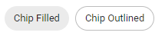 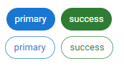 |
| stepper | Display icons showing the progress and status of work tasks. |
(Table) Button properties (UI version 1.1)
| Label | Default value | Required | Description | |||
|---|---|---|---|---|---|---|
| components: | Yes | UI component | ||||
| type: | Yes | Specify "button". Execute actions defined for each component. Placed to the right end of the grid. |
properties: | No | ||
| buttons: | Yes | Configure detailed button settings. | ||||
| - name: | Yes | Button name | label: | No | Button display name | action: | Yes | Specify the action to be executed when a button is clicked. For details, see "Script". |
(Table) Card properties (UI version 1.1)
| Label | Default value | Required | Description | ||||
|---|---|---|---|---|---|---|---|
| components: | Yes | UI component | |||||
| type: | Yes | Specify "card". | |||||
| properties: | No | ||||||
| image: | No | Specify if displaying images. | |||||
| src: | No | Image file name Store images in the same directory as the YAML file for the UI that uses the Card component. |
|||||
| position: | left | No | Image position "top", "bottom", "left", "right", or "background" can be specified. |
||||
| sx: | No | Specify based on the sx properties of the Material-UI. For more details, see the website(s) below. https://v7.mui.com/system/getting-started/the-sx-prop/ |
|||||
| height: | No | Height | |||||
| width: | No | Width | |||||
| link: | No | Navigation destination when clicked | |||||
| content: | No | Display contents Specify in HTML format. If nothing is specified, the destination set in "link" is displayed. |
|||||
| clickable: | all | No | Clickable scope The following can be specified.
|
||||
| sx: | No | Specify based on the sx properties of the Material-UI. For more details, see the website(s) below. https://v7.mui.com/system/getting-started/the-sx-prop/ |
|||||
| height: | No | Height | |||||
| width: | No | Width | |||||
(Table) Iframe properties (UI version 1.1)
| Label | Default value | Required | Description | ||||
|---|---|---|---|---|---|---|---|
| components: | Yes | UI component | |||||
| type: | Yes | Specify "Iframe". | |||||
| properties: | No | ||||||
| url: | Yes | Specify the URL to embed. | |||||
| sx: | No | Specify based on the sx property of Material UI. For details, see the following: https://v7.mui.com/system/getting-started/the-sx-prop/ |
|||||
| maxHeight: | No | Maximum height | |||||
| maxWidth: | No | Maximum width | |||||
| minHeight: | No | Minimum height | |||||
| minWidth: | No | Minimum width | |||||
| height: | No | Height | |||||
| width: | No | Width | |||||
| allow: | No | Specify the value for the allow option of iframe Required to perform the following clipboard operations from a page inside the iframe.
allow: clipboard-read https://dash.{{.System.domain}}; clipboard-write https://dash.{{.System.domain}} |
|||||
(Table) Tabs properties (UI version 1.1)
| Label | Default value | Required | Description | ||
|---|---|---|---|---|---|
| components: | Yes | UI component | |||
| type: | Yes | Specify "tabs". | |||
| properties: | No | ||||
| type: | Yes | "tab", "toggle", or "dynamic" can be specified. If "toggle" is specified with "Paper" directly above, display the button at the position of the Paper title label. | |||
(Table) Tab properties (UI version 1.1)
| Label | Default value | Required | Description | ||||
|---|---|---|---|---|---|---|---|
| components: | Yes | UI component | |||||
| type: | Yes | Specify "tab". | |||||
| properties: | Yes | ||||||
| icon: | No | If the type is set to "toggle", specify the icon to be displayed from among the MUI icons. | |||||
| visible: | true | No | The following can be specified.
|
||||
| dataSource: | No | Specify the dedicated dataSource for the tab. Specify in the Dynamic tab in cases where the same dataSource is to be used for each tab. | |||||
| schemas: | No | ||||||
| - ref: | Yes | Specify the name of the schema data source. The name defined in uiManifest.dataSource.schemas[] must be specified. | |||||
| tables: | No | ||||||
| - ref: | Yes | Specify the name of the table data source. The name defined in uiManifest.dataSource.tables[] must be specified. | |||||
| action: | No | Specify the actions for handling events that occur in table data sources. | |||||
(Table) Article properties (UI version 1.1)
| Label | Default value | Required | Description | |||
|---|---|---|---|---|---|---|
| components: | Yes | UI component | ||||
| type: | Yes | Specify "article". | ||||
| properties: | No | |||||
| ticketid: | Yes | Specify the source for obtaining ticket IDs. | ||||
| type: | Yes | The following can be specified.
|
||||
| value: | Yes | Specify the following by type.
|
||||
| ds: | Yes | Specify the source for obtaining the ds of ticket APIs. | ||||
| type: | Yes | The following can be specified.
|
||||
| value: | Yes | Specify the following by type.
|
||||
| customer: | false | No | Specify whether or not the window is for use by customers. Specify "true" or "false". |
|||
| maxHeight: | No | Maximum height | ||||
| maxWidth: | No | Maximum width | ||||
| minHeight: | No | Minimum height | ||||
| minWidth: | No | Minimum width | ||||
| height: | No | Height | ||||
| width: | No | Width | ||||
(Table) Attachment properties (UI version 1.1)
| Label | Default value | Required | Description | ||
|---|---|---|---|---|---|
| components: | Yes | UI component | |||
| type: | Yes | Specify "attachment". Upload or download files. |
|||
| properties: | No | ||||
| editable: | false | No | The following can be specified.
|
||
| hintMessage: | No | Set text strings to be displayed as hint messages. Display a question mark icon next to the label. Click on the question mark icon to display the set values. | |||
(Table) Label properties (UI version 1.1)
| Label | Default value | Required | Description | ||||
|---|---|---|---|---|---|---|---|
| components: | Yes | UI component | |||||
| type: | Yes | Specify "label". Displays text. |
|||||
| properties: | No | ||||||
| source: | No | Specify the type of the dataSource to use. Specify "table". This is required if contentRef is specified. |
|||||
| contentRef: | No | Label component and the path of the data to display in the column Specify it as data-source-name.field-name. This is required if "source" is specified. |
|||||
| content: | No | Specify the string to display. A line break can be inserted with "\n". If both "contentRef" and "content" are specified, "content" takes precedence. |
|||||
| fontSize: | No | Specify the font size. | |||||
| fontWeight: | No | Specify the font weight. | |||||
| color: | No | Specify the font color. | |||||
| maxLines: | 0 | No | Maximum number of display lines If the number of wrapped lines exceeds the set value, an ellipsis (...) is displayed at the end. If "0" is specified, there is no limit on the number of lines. |
||||
| showTooltip: | false | No | If "true" is specified, a tooltip is displayed. The tooltip shows the string displayed in the label component. Even when displayed with truncation by maxLines, the full string is shown. |
||||
| formats: | No | Apply formatting to the data specified by contentRef or to the value of content. Specify the formatting method in "method", and specify the parameters corresponding to the method in "parameters". It is applied in array format, in order from the top. |
|||||
| - method: | No | Specify the formatting method.
|
|||||
| parameters: | No | Specify the parameters according to the method.
|
|||||
| fromNow: | No | If "true" is specified, the entered date is converted to a time relative to the current time. Example: If the input value is "2025-06-10T12:00:00Z" and the current time is "2025-06-10T15:00:00Z," it is displayed as "3 hours ago." |
|||||
| displayFormat: | No | Specify the format of the date to display. If omitted, the Ops I standard format is applied. Examples:
|
|||||
| toUserTimezone: | true | No | If "true" is specified, the entered date is converted to the date of the user's time zone. If "false" is specified, the browser's time zone is used. | ||||
| decimalPoint: | No | Specify the maximum number of decimal places to display (within the digit limits of JavaScript). | |||||
| rounding: | round | No | Specify one of the following.
|
||||
| prefix: | No | A string to display on the left side of the displayed value | |||||
| suffix: | No | A string to display on the right side of the displayed value | |||||
(Table) Icon properties (UI version 1.1)
| Label | Default value | Required | Description | |||
|---|---|---|---|---|---|---|
| components: | Yes | UI component | ||||
| type: | Yes | Specify "icon". | ||||
| properties: | No | |||||
| source: | No | Type of the dataSource to use Specify "table". This must be configured together with switch and cases. |
||||
| type: | Yes | Use icons provided by Material UI. For details, see the following: https://v7.mui.com/material-ui/material-icons/ |
||||
| color: | #666666 | No | Specify the icon color. For details, see the following: https://developer.mozilla.org/ja/docs/Web/CSS/color_value |
|||
| size: | 18px | No | Specify the size of the icon. (Set the same size for both height and width.) When a numeric value is specified, it is set as px. When a string is specified, units such as px and em can be used. For details, see the following: https://developer.mozilla.org/ja/docs/Web/CSS/length |
|||
| tooltip: | No | Specify the value to display on the icon tooltip. | ||||
| switch: | No | Specify the field name of the data source. Specify in the format data-source-name.field-name. Used to compare with the case value of the "cases" label and determine whether they match. This must be configured together with source and cases. |
||||
| cases: | No | Specify the match condition and the type and color of the icon when a match occurs. This must be configured together with source and switch. |
||||
| - case: | Yes | Specify the value to be used for evaluation with the data source field specified in switch. | ||||
| type: | No | Specify the icon to display when the condition is met. Use icons provided by Material UI. If not specified, the icon specified in the "type" label of the upper hierarchy is displayed. | ||||
| color: | No | Specify the color of the icon to display when the condition is met. If not specified, the color specified in the "color" label of the upper hierarchy is displayed. For details, see the following: https://developer.mozilla.org/ja/docs/Web/CSS/color_value |
||||
| tooltip: | No | Specify the value to display on the icon tooltip when the condition is met. If not specified, the value specified in the "tooltip" label of the upper hierarchy is displayed. | ||||
<Definition example>
apiVersion: 1.1
kind: ui
## Meta data
type: resource
name: sample_request_1_ui
label: sample_request_1_ui
description: sample_request_1_ui
## Dependencies
includes:
- kind: datamodel
name: all_type_columns_datamodel
- kind: script
name: check_value_input
- kind: attachment
name: test_attachment
context:
type: uipath
value: workflow_detail_by_context_id
attachment: test_attachment
dataSource:
tables:
- name: table_ds1
table: type1_table
- name: table_ds3
table: type3_table
- name: table_ds2
table: type2_table
- name: group
table: group
components:
- name: grid_container
type: grid
properties:
container: true
justifyContent: center
children:
- name: grid_item
type: grid
properties:
item: true
children:
- name: test_paper
label: Form 1 for testing
type: paper
properties:
icon: Assignment
children:
- name: test_form1
label: test_form1
type: form
properties:
fields:
- field:
all: table_ds1.smallint
label: smallint
name: smallint
source: table
properties:
required: true
xs: 3
sm: 3
- field:
all: table_ds1.integer
label: integer
name: integer
source: table
properties:
xs: 3
sm: 3
- field:
all: table_ds1.decimal
label: decimal
name: decimal
source: table
properties:
xs: 3
sm: 3
- field:
all: table_ds1.serial
label: serial
name: serial
source: table
properties:
readOnly: true
xs: 12
sm: 12
load: false
- field:
all: table_ds1.money
label: money
name: money
source: table
- field:
all: table_ds3.enum
label: enum
name: enum
source: table
- field:
all: table_ds3.cidr
label: cidr
name: cidr
source: table
- field:
all: table_ds2.varchar
label: varchar
name: varchar
source: table
- field:
all: table_ds2.date
label: date
name: date
source: table
- field:
all: table_ds2.text
label: text
name: text
source: table
- source: table
name: lookup
field:
all: table_ds2.lookup
label: lookup
properties:
required: true
xs: 12
sm: 12
md: 12
displayName: group.name
lookup:
source: table
field: group.id
displayColumn:
- group.name
- name: attachment_name
type: attachment
label: attachment
properties:
editable: true
buttons:
- type: save
name: save
label: save
- type: accept
name: accept
label: apply
- type: custom
name: check_value
action: check_value_input
label: Check Value
- type: custom
name: save_attachment
action: save_attachment
label: Save Attachment